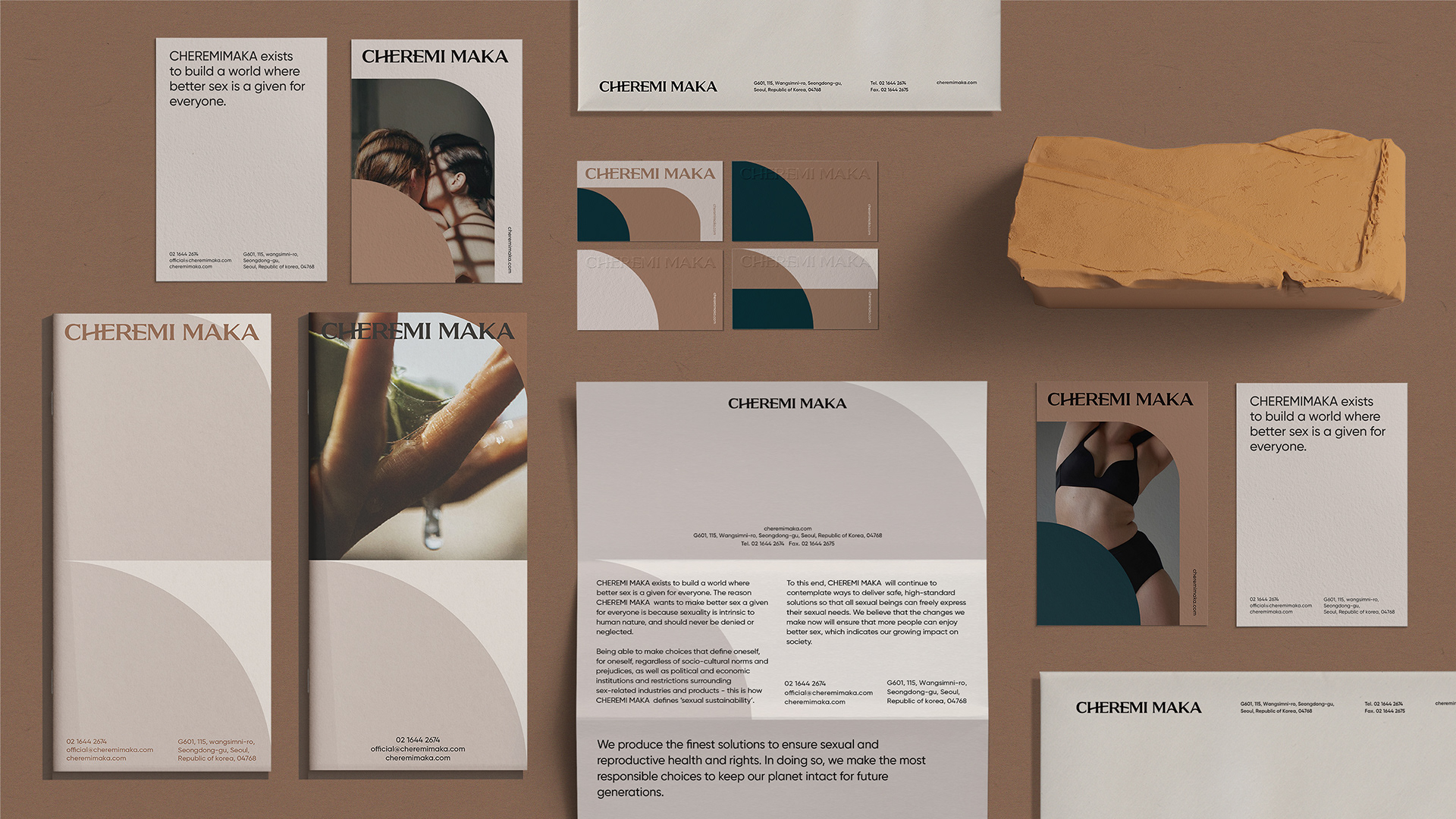
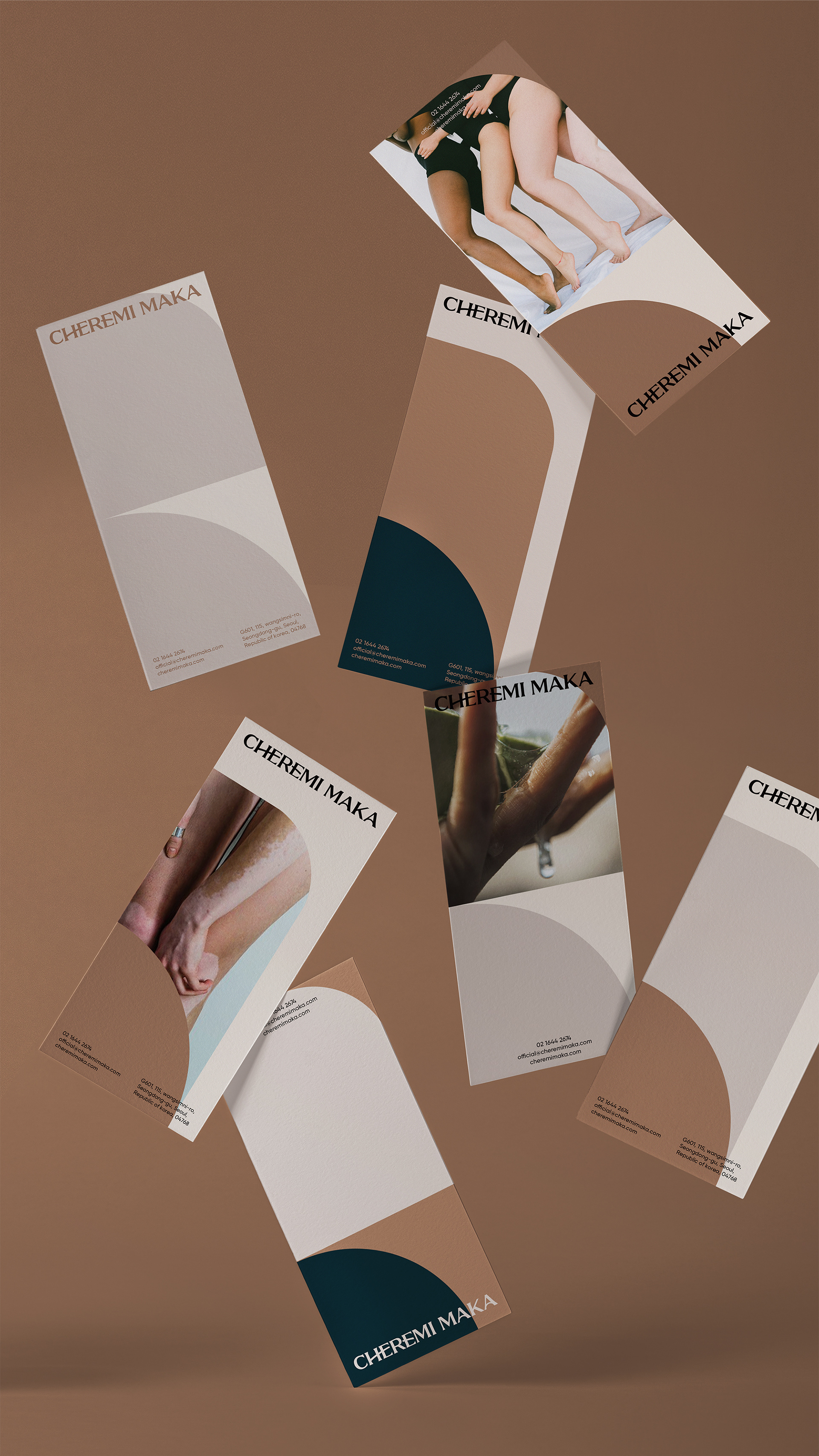
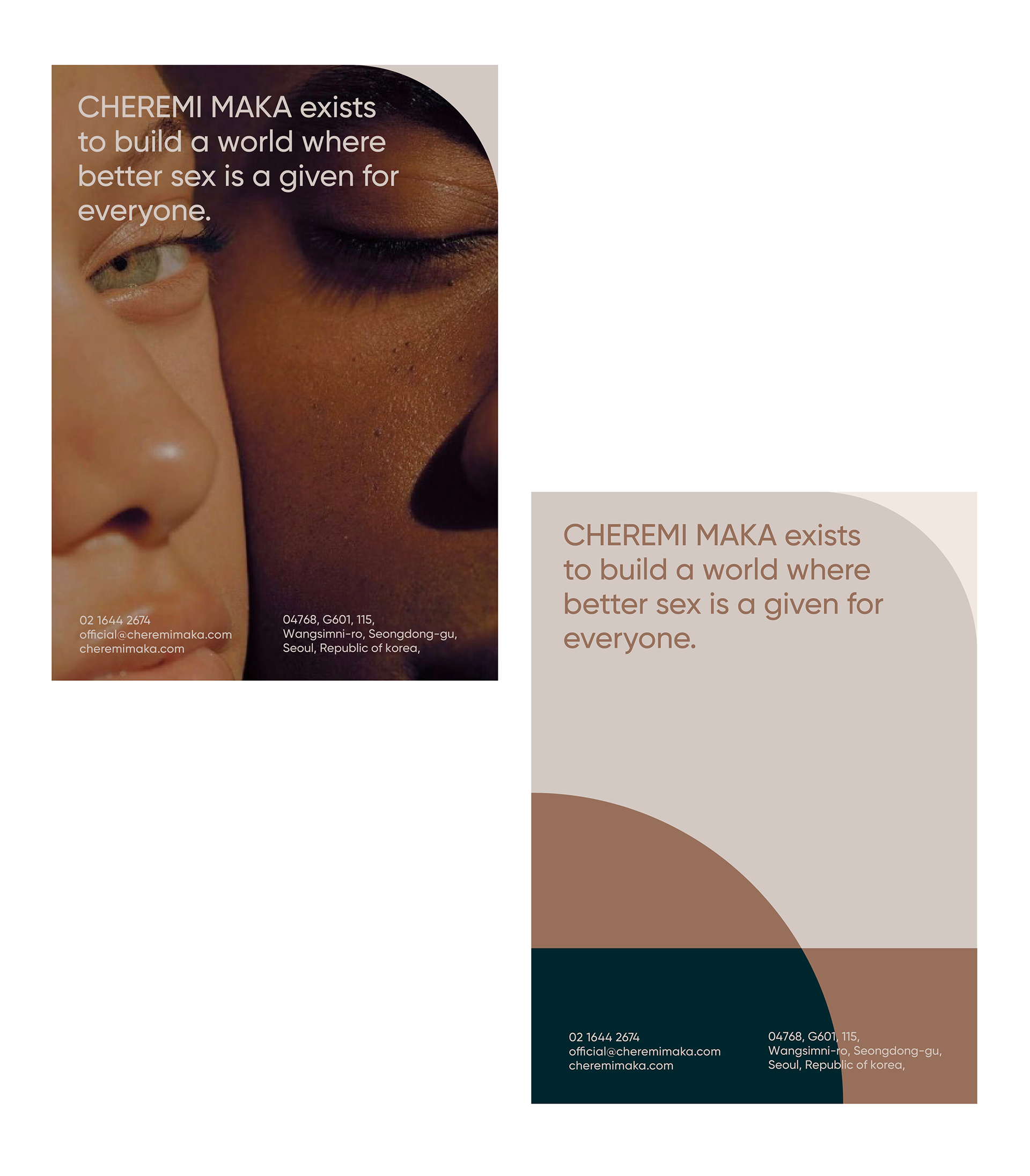
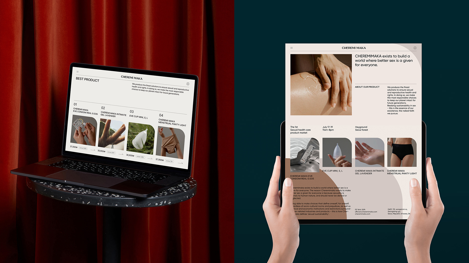
CHEREMI MAKA Branding
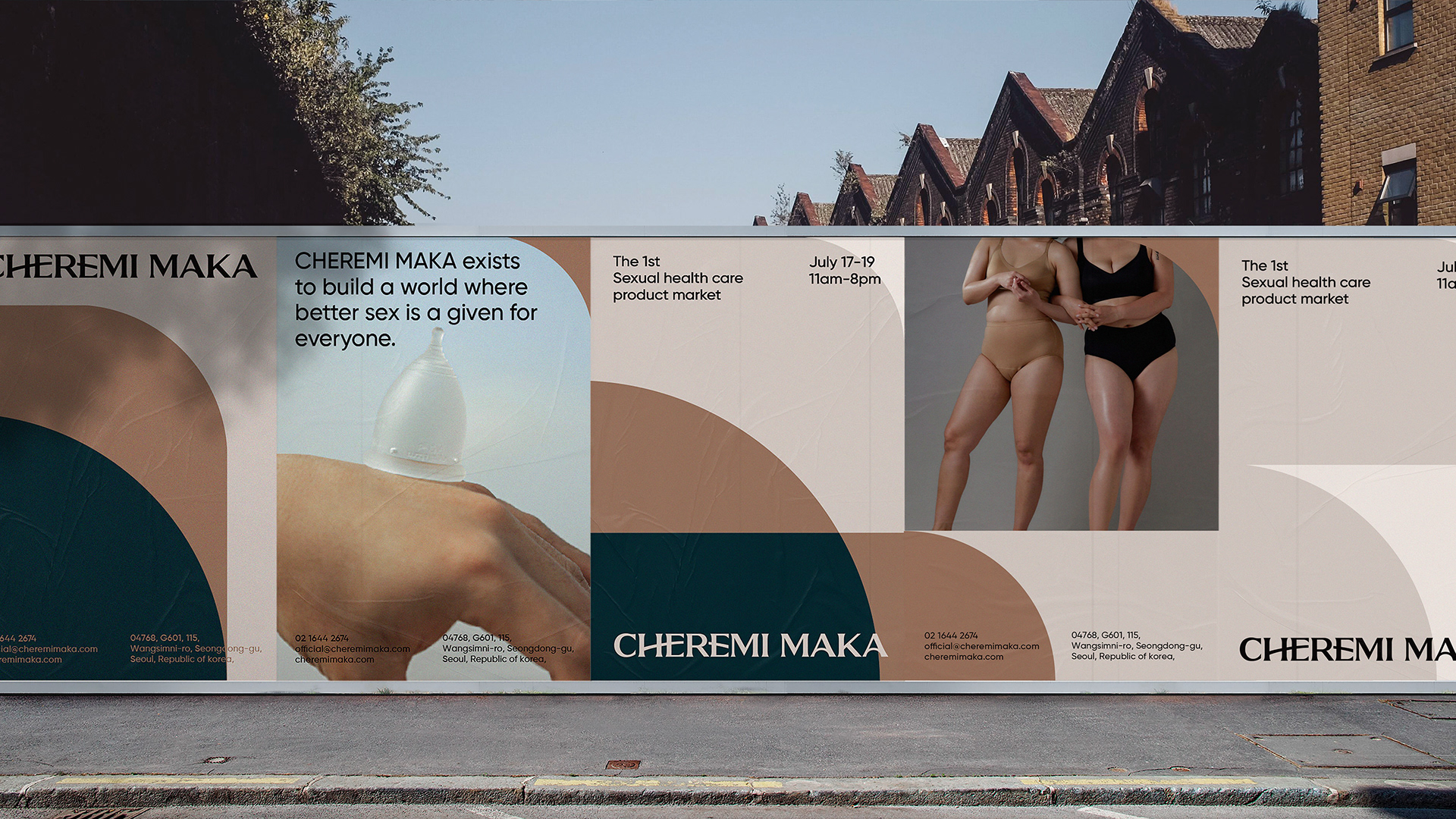
Cheremimaka is a sexual health care brand that specializes in manufacturing products related to sexual health,
such as condoms, lubricants, and menstrual cups. To reinforce its identity as a company that pursues economic, environmental and
social sustainability, the brand name was changed to 'Cheremimaka,' meaning 'everything as is,' rebranding it as a ‘refined,’ ‘healthy’ and
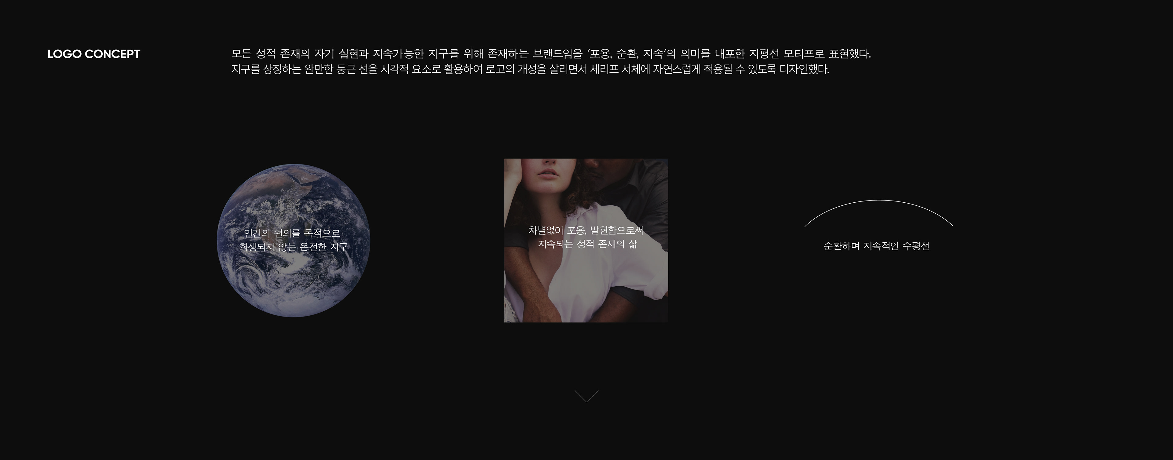
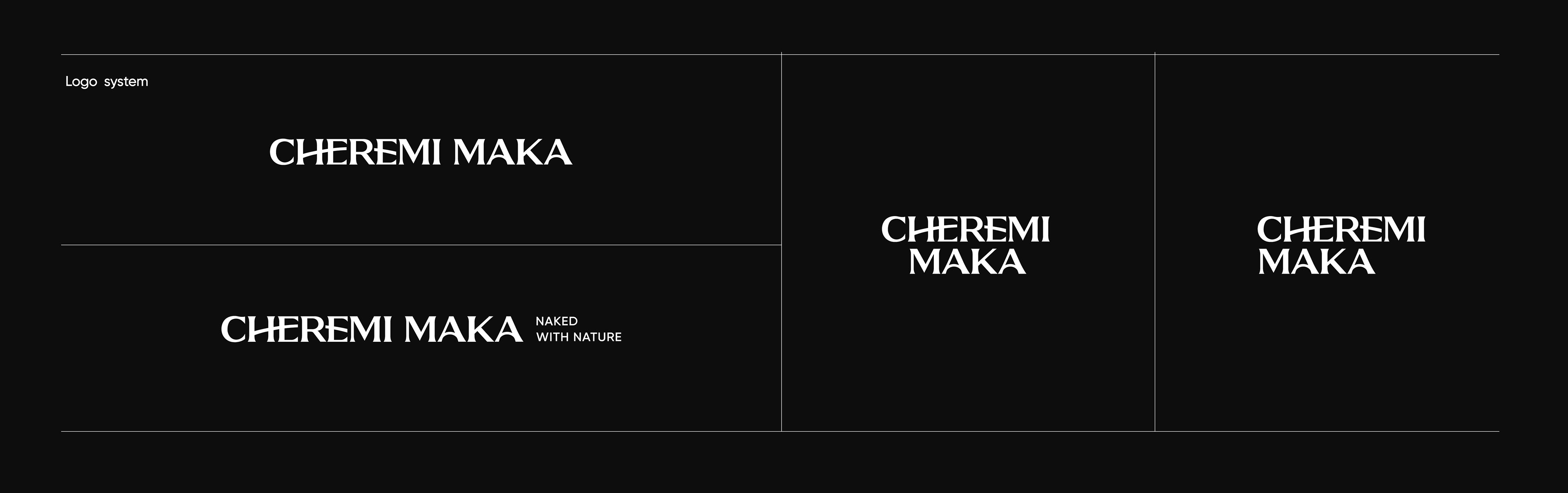
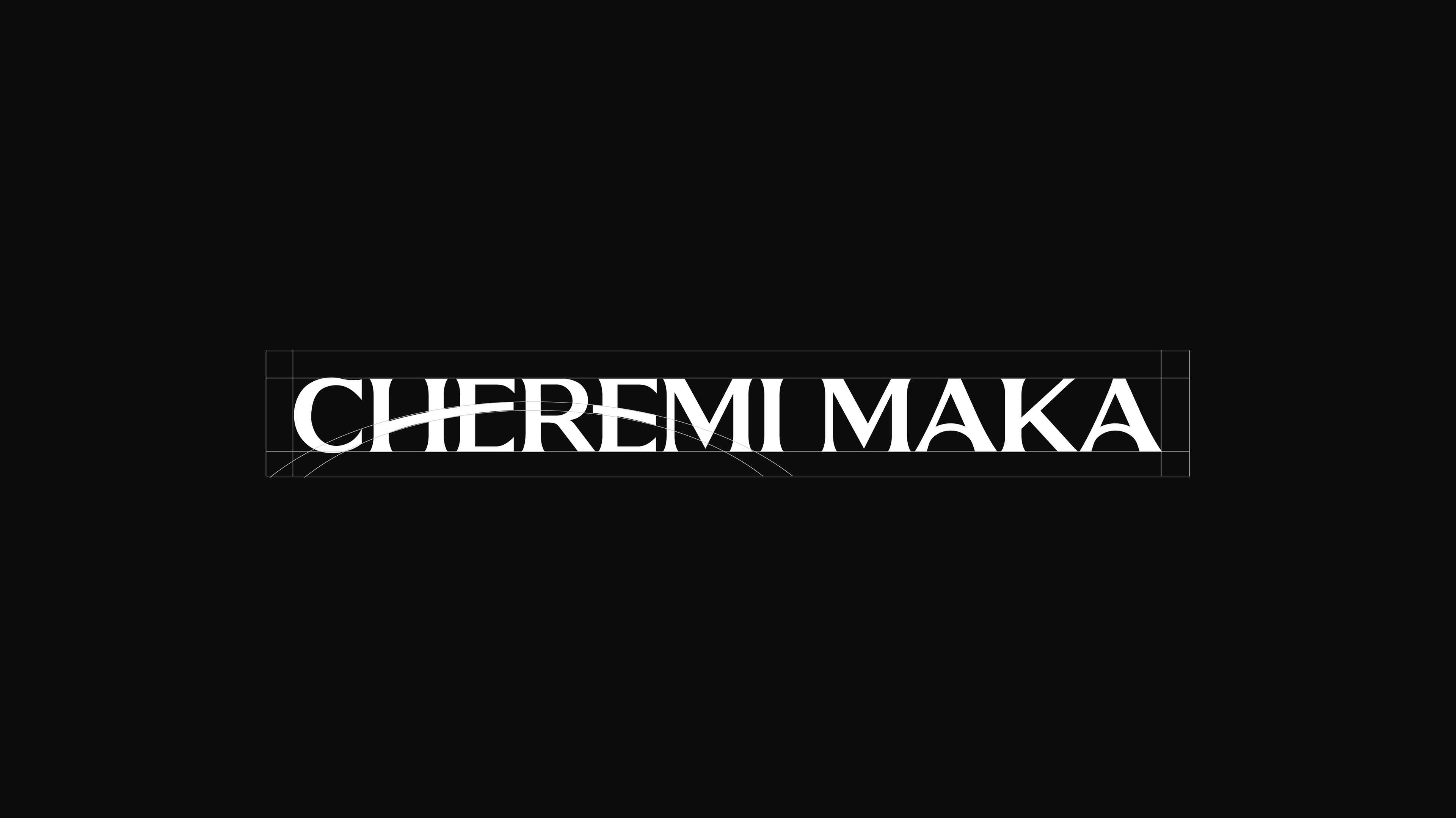
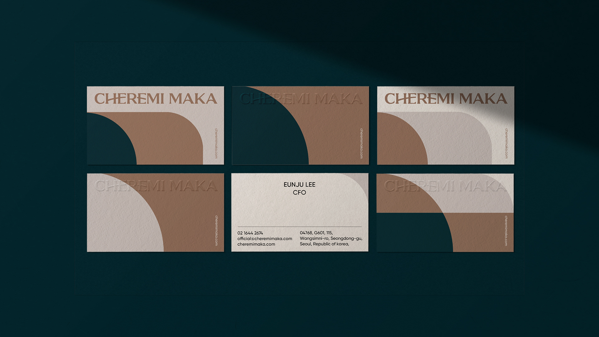
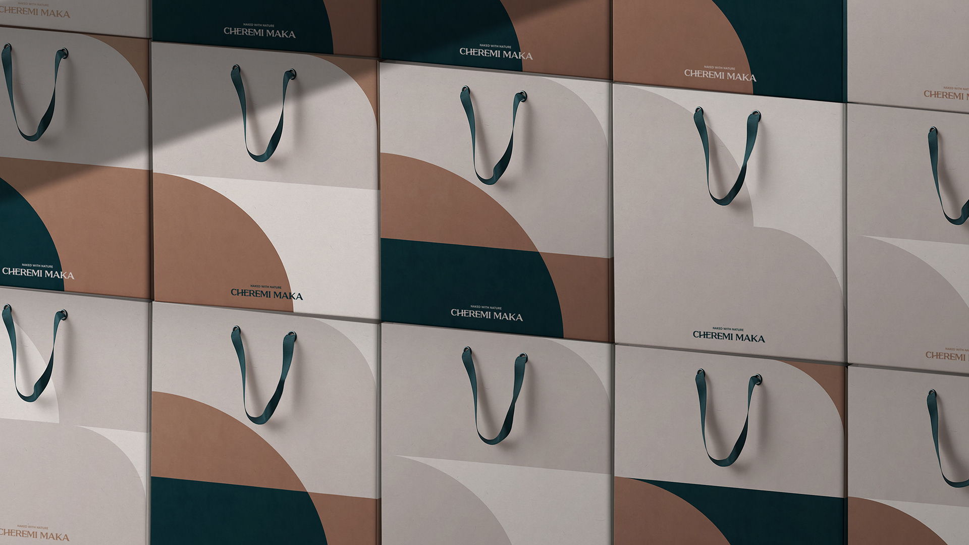
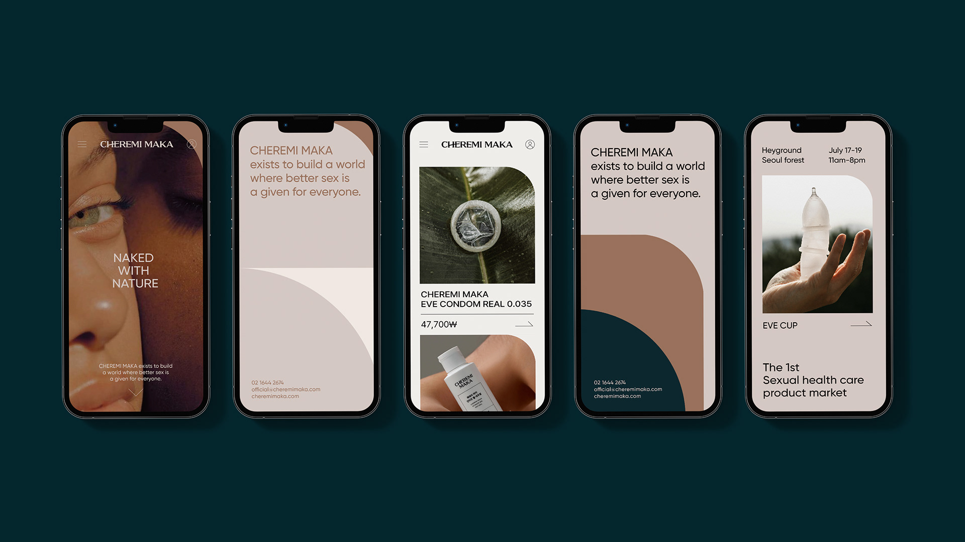
‘inclusive’ brand. A round line symbolizing the earth was applied to the horizontal strokes of Cheremimaka's logotype to intuitively express
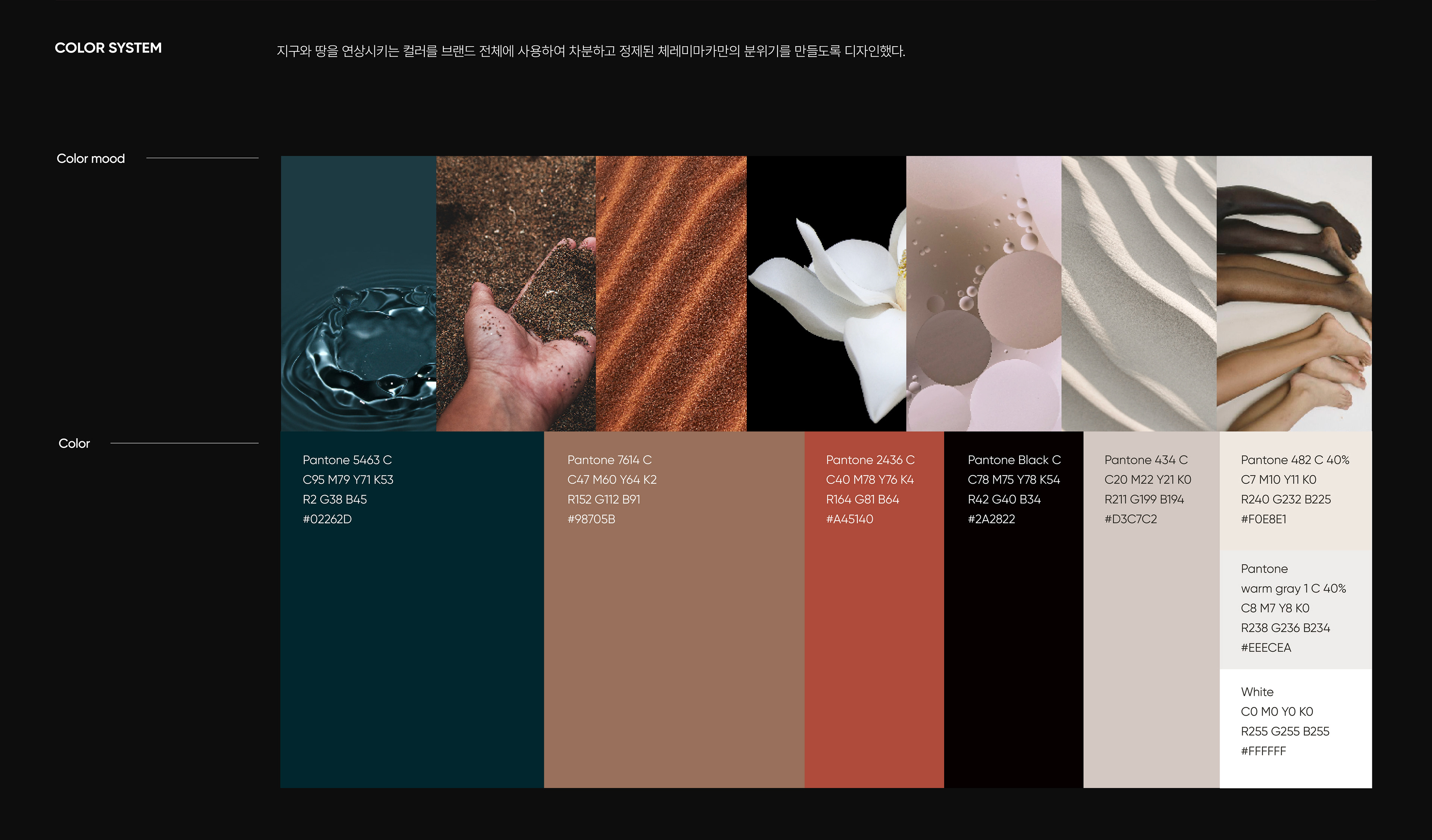
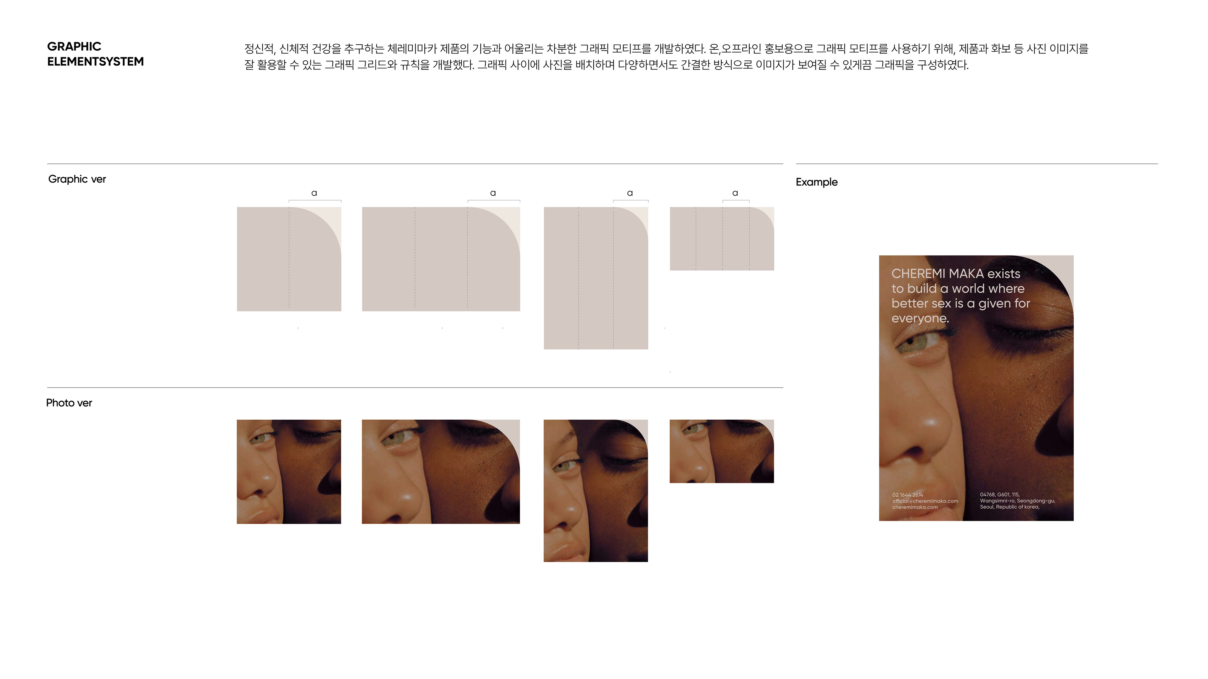
the brand’s core value of sustainability. The color palette that is used throughout the entire brand was also inspired by the colors of earth
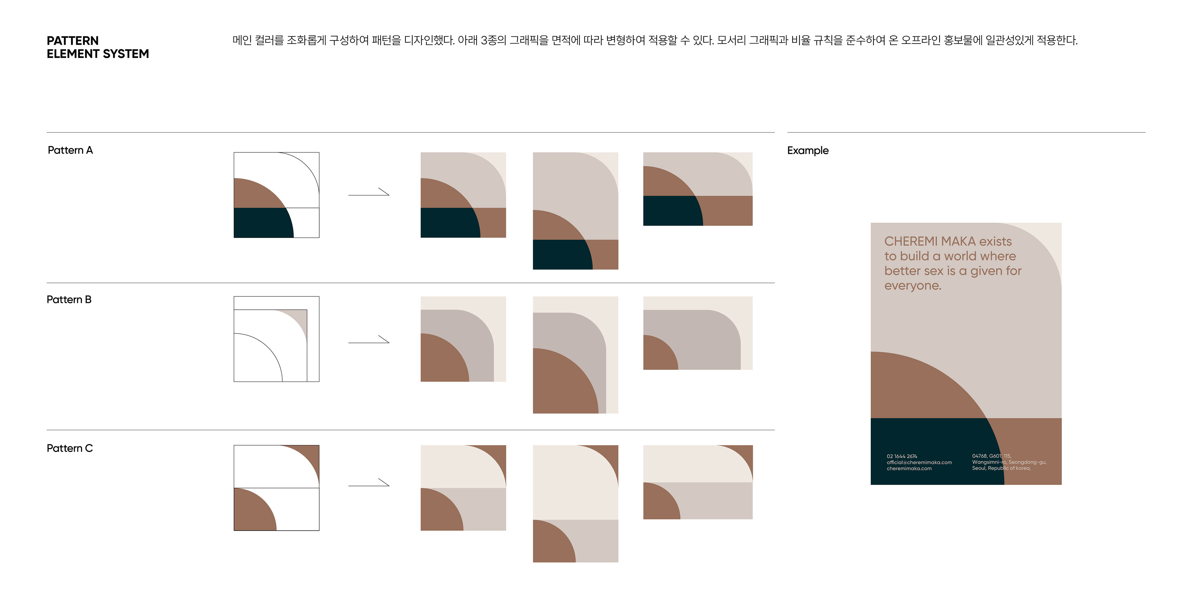
and nature. The visual element of the earth represents Cheremimaka's philosophy that considers nature and the environment, and
invokes ideas of a sustainable life cycle and circulating nature.
-
체레미마카는 콘돔, 윤활제, 생리컵 등 성건강에 관련한 제품들을 전문적으로 생산하는 섹슈얼 헬스케어 브랜드입니다.
경제적·환경적·사회적 지속가능성을 추구하는 기업으로서 아이덴티티를 강화하기 위해, 브랜드명을 ‘모두 그대로'라는 뜻을 가진
‘체레미마카’로 변경하며 새 브랜드의 이미지가 필요했습니다. 이에 ‘정제된', ‘건강한’, ‘포함하는’ 이라는 컨셉으로 체레미마카만의
아이덴테티를 정립하는 리브랜딩 프로젝트를 진행했습니다.

Client Instingtus
Participation Logo design, Brand strategy, Key visual system, Application design
PM Hansol choi, Yeonghee kim
Brand Design Yeonghee kim, Jiyeon oh Assistant Eunbi seong
Planning&Verbal Hansol choi
Date 2022 slowalk project